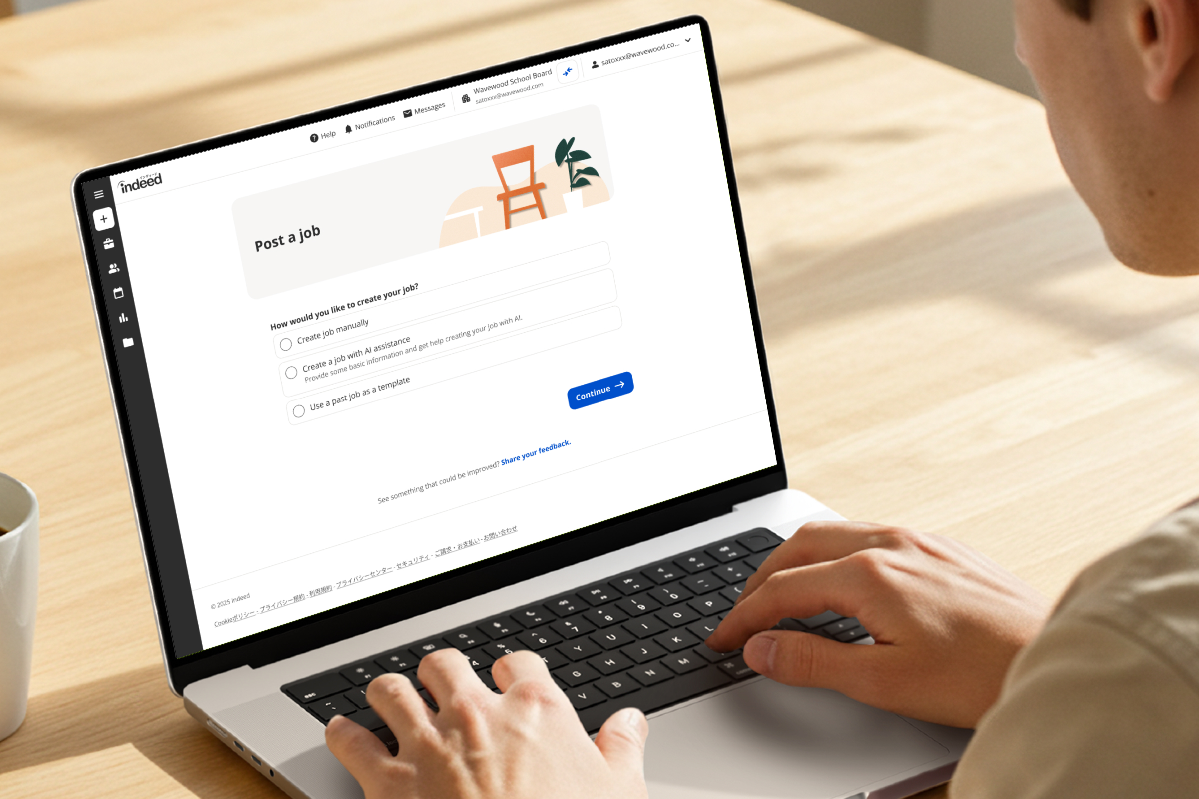
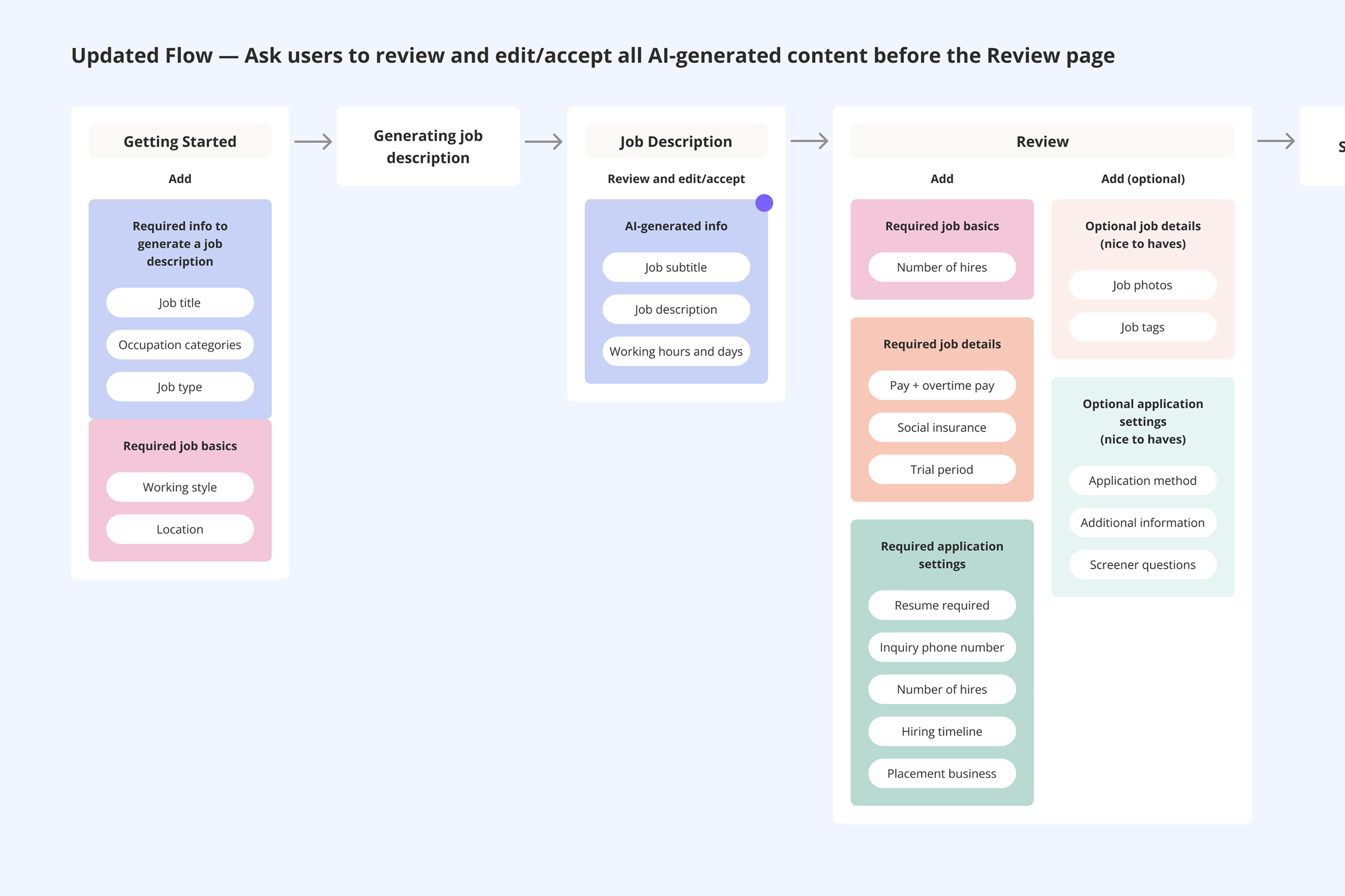
Indeed's "One Click" flow uses AI to help small business employers in Japan post jobs quickly — without needing hiring expertise or strong tech confidence. Launched in late 2024, it was adopted by 20% of new SMB employers almost immediately. But nearly half of users were abandoning the flow before completing it, a significantly higher drop-off than the standard posting experience. I led UX improvements end-to-end: from audit through to design delivery and A/B test results.

drop-off in One Click flow
drop-off in standard flow
abandoned on Review page specifically
I led a UX audit of the full flow to understand why. The root causes were clear:
User testing confirmed the pattern – users couldn't find where to edit AI-generated content and gave up when they couldn't. Client support feedback put it plainly – "Too many clicks, too much text, too hard to understand."

User goals:
Business goals:
Success metrics: reduce Review page drop-off · increase overall completion rate · reduce time to post
My hypothesis was that users arrived at Review already overwhelmed, having never had a clear chance to understand or edit what the AI had generated for them. The solution wasn't to simplify Review in isolation, it was to restructure the entire flow so users could engage with AI-generated content earlier, with more control and less cognitive load at each step.
Trade-off considered
I explored consolidating the multiple job description input fields into a single free-text field — simpler for users, and more consistent with Indeed's experience in other markets. But after working through the implications with the PM, engineers, legal, and taxonomy teams, the backend cost was too high for this iteration. We kept the structured inputs and agreed to revisit consolidation in a future phase.
Moved the job description earlier
I introduced a dedicated Job Description step where users could review, edit, and accept AI-generated content before reaching the Review page, giving them genuine control at the right moment, not too late.
Replaced 8 consent checkboxes with 1
Consolidating per-section checkboxes into a single confirmation reduced anxiety and sped up the flow significantly.
Pre-filled and removed unused fields
Common fields like hiring timeline were pre-filled. Fields that data showed were rarely completed were removed, reducing the perceived length of the form.
Simplified the Review page
With the job description handled earlier, Review could focus on what it should be – a final check, not a content editing session.

Drop-off on Review page – an 8 point reduction
Overall completion rate – thousands of additional job postings at Indeed Japan's scale
Time to complete the flow decreased across the board
Improved step tracking made it easier to identify future friction points
Complexity builds quietly – one modal, one checkbox, one hidden field at a time. None of it feels like a crisis on its own, but it compounds into an experience that feels impossible to finish.
Users weren't resistant to AI-generated content — they just needed to feel in control of it. Moving the job description earlier and giving users a clear moment to review and accept it changed things noticeably. The AI stopped feeling like something happening to them and started feeling like a tool they were choosing to use.